Thursday, June 11, 2009

BookCover


I chose my design for my book to be simple, with colours, and no additional impact, to suit the genre of the book. Which is to a book that’s straight to the point of it, Is YouTube the New Teacher? I choose to use a Big YouTube Logo in front of the book, so that it is clearly visible what book it is. The colours of the text were choosen to match YouTube’s logo. The Authors name was in a font that was more to the side of hand written, so show a personal connecting. I choose Arial for the back of the book, since it is a simple easy to read font that appears to be simple. The background was left white, since I feel that white with colour font and logo, shows a empowering theme, which is made to suit the book.


Friday, May 8, 2009

Typographic Self-Portrait


I choose to do my typographic assignment, not too abstract. Since it had to relate to myself, and my personality. I think that im pretty straight forwarded, therefore i choose the shaping of my face to be with normal letters (spelling my name over and over again) to show the outline. But also there is a lot about me that people dont know. Which is why some parts are in very fine print, making it hard to see unless you look close at me.

Monday, April 27, 2009


Our school held a Anti-Smoking Campaign, which students were asked to create pieces of art that they thought showed the point, of anti-smoking.
Our graphics class were asked to make 3ads. One Poster, 10" by 16", a Traditional art form and one Non-traditional art form.

To start, i 'googled' Reasons to quit smoking. Many facts came up, I choose one by thinking on what would catch an eye. Which i thought was numbers, ratios, for people to see that affect it has. From there i came up with my slogan.

Above^, is my Poster that is 10"by16". The picture was self took, and edited with Adobe Photoshop. The placement of the text was chosen by not placing it aligned, so it does not look too formal. The three cigarette characters at the bottom right, was a tie-in for the entire ad series. Like a Known label, such as the Stupid.ca Skull.


This is my Traditional art form. I choose to do a subway poster. So i changed the sizing of the original poster to 7"by16". And moved the text up to the top left corner.


And this is my non-Traditional art form. I decided to do stickers, So i printed these out on sticker sheets, and cut them out. I choose stickers because, i think they are a easy fast spread of advertisement. And with a known logo, people would recognize the campaign.

Tuesday, March 31, 2009

Skills Challenge Logo

I created three possible designs that i like;
The first one, LCI TECH SKILLS CHALLENGE with an paper airplane;

I like this logo because it very plain, as well as my other ones. I think that the airplane shows simplicity of abstract idea that involve a paper airplane. Creativity to make one, all the math and physics that lie behind it, etc.

Another design is, LCI TECH SKILLS CHALLENGE with a lightbulb;

I like this one due to the text and image placement. The light bulb represents technology by creative ideas, its need everywhere, the technology that was put into making it.

Lastly my last design was, LCI TECH SKILLS CHALLENGE with puzzle pieces;

This one is my least favourite, but i still believe it is a good logo. Placing of text is hard to place for it to have good unity and be visually pleasing.

Thursday, March 12, 2009

Tutorial Website

http://www.tutorialized.com
^ A tutorial website for many programs, such as Adobe Photoshop.
Many interesting,cool effects and tips&tricks can be found on this site.

Tuesday, March 10, 2009

Bansky, Graffiti artist

http://www.banksy.co.uk
^ Bansky is a Graphic Designer in a sense of creating art pieces on a medium of walls.
His art pieces or more then just tags to exploit his name. They show creativity, use of environment, planned out, rebellion to society.

Monday, March 9, 2009

Album Cover Assignment


From A Random Wikipedia name, random quote and Random image, This is what i came up with. Gropu River, is the name of the band. To me, it sounded like a two people group, one that sings and one that plays an acoustic guitar. Then i clicked the link to a random flickr image, and that one (referring to the Cover background) and thought it was perfect for it. Showing the feel of a simple city/urban life of musicians telling there story of a rough life. With the rough background and the accordian player in the centre. The Quote seemed to have ironicaly fitted as well "thread which is not there" interupting its meaning as something simple, but yet does a whole lot is missing ( thought apon a thread in a shirt; simple, but holds it all together) so the album would be about some struggles the artists are going through. The layout was simply chose but where the wording would fit the best, staying simple, but noticable. The font was choosen beacuse i thought that these fonts are complementary to the image. It is simple, but also so heart-felt meaning within it.

This is my second album cover. Once again i thought that everything that i was given sutied each other. The Name of the band, Dasyurmorphia, actuall meaning is a carnivorous animals, like the Tasmanian Devil. From this i thought of a band that plays Punkrock with a gothic feel to it. The colours i chose where to match the background image, since it was with a light blue tint, i choose a dark blue for font. The Placing of the font was to fit with the images focal point (the body on the floor). The font choice seemed to fit with the 'stlye' of the band, Bold and Sharp edges.

Friday, March 6, 2009

Elments & Principles of Design


This is my vector Element & Design Poster. I decided to Use this layout and these colours because i thought it would stand out, and draw eyes attention to it. I used a layout of placing all Elements on one side and Principles on one side, making it look balanced. I choose a colour i like, then using other colours that look visual appealing along wiht the background. Done with Adobe Illustrator, using some of the many tools, Pen, Shape, Text, etc. The Information was found through many sources over the internet, by using google. I am overall happy with the poster, except to me it feels too busy, and the titles do not stand out as much as it could.

Thursday, February 12, 2009

TGJ 3MG - Vector Assignment

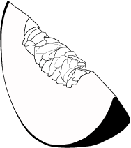
The Vector Assignment was to find and image from the web and create a vector form of it, traced, as well as free hand, on Adobe illustrator. The picture i used was a picture of a melon. Using the tools; Pen, Pencil, and fill, i was able to trace the image into a black and white vector. Creating organized steps to filling up the parts of the melon, deciphering which parts to be black or white.
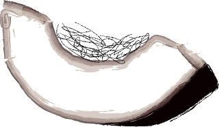
The Abstract drawing was done with a more freely and open mind and hand. Using just the Brush tool, and the fill tool. Free handed i drew of the outsides of the melon, then simple filled the skin of it. Then quickly drew the seeds with the brush tool, to give it a unorganized look of placing of the seeds.


- Overall i like my traced vector image the best. It shows more shape, and 'fullness'.